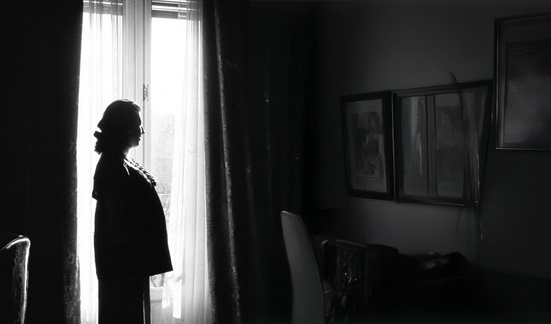

Our main collection in silver with semi-precious stones and hydrothermal quartz.
At Luxenter, each collection is born with a purpose: to make your essence shine. We believe in jewelry as a form of expression, a way to tell who you are without saying a word. That’s why our collections are designed to accompany you in every stage of life, from the most everyday to the most extraordinary.
Our designs combine trend and timelessness, merging high-quality materials such as sterling silver, natural stones, or steel with delicately crafted finishes. The result: versatile jewelry, with character, that adapts to your style and evolves with you.
When you have a special event, the goal is to shine.
Each collection is its own universe, inspired by art, nature, travel, or feminine strength. They are small works of art that transform the everyday into something special, turning a detail into the protagonist and a look into a statement of intent.
Discover the Luxenter universe, where each piece has a story, and each story, a jewel. We design for you to shine your way, without rules, without limits, with authenticity. Because at Luxenter, your light is our inspiration.
ATELIER
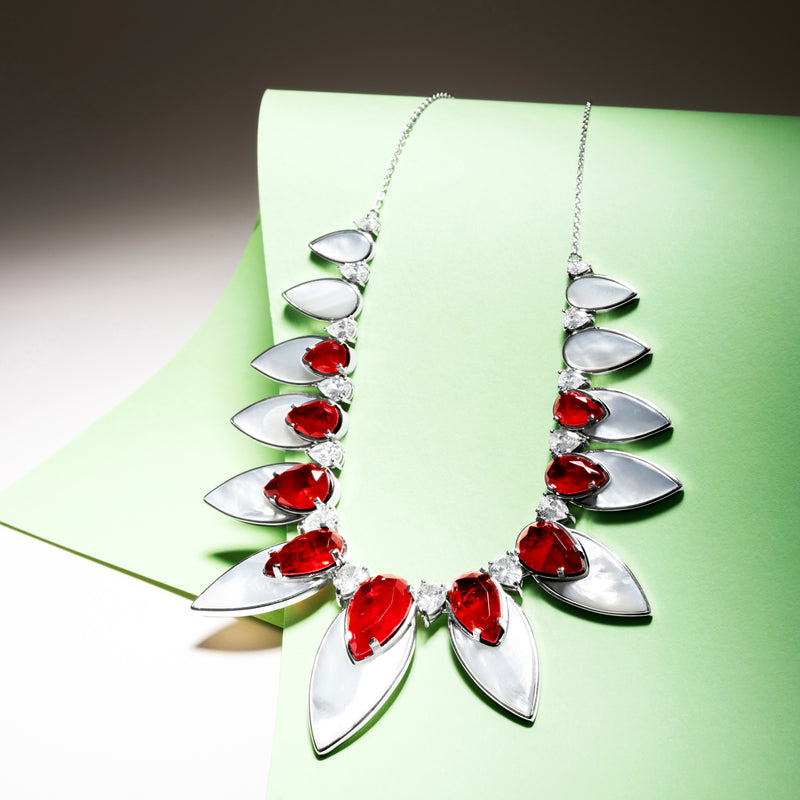
Atelier is the pinnacle of designer jewelry at Luxenter. A collection where art, technical precision, and aesthetic sensitivity merge into unique pieces, crafted in sterling silver and set with stones of high visual impact. It is a proposal that exudes character, sophistication, and contemporary luxury.
With meticulous micropavé work, carefully balanced color plays, and volumes that stand out for their sculptural presence, Atelier represents the highest level of creativity and demand of the brand.
Tones that evoke the intensity of sapphire, the depth of emerald, or the magnetism of ruby illuminate pieces full of strength and elegance.
The collection is structured in very expressive chromatic lines: deep greens, intense blues, energetic fuchsias, golden citrines, refined pastels, and multicolor combinations, which turn each jewel into a focal point of light and personality. The contrast between polished, golden, and blued finishes adds dimension and visual strength to each design.
MOMENTS TO SHINE
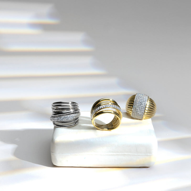
Moments to Shine is a collection designed to accompany the rhythm of each day with a touch of serene elegance. Inspired by the beauty of simplicity and the strength of small gestures, this line brings together versatile, contemporary designs full of intention.
Crafted in sterling silver with polished finishes, striped details, color contrasts, and delicate volumes, it offers a palette of styles that adapts to all women: from the most minimalist to those seeking a soft yet present shine. The bicolor combinations, textured effects, and geometric hints add dynamism and modernity to a collection designed to last.
Moments to Shine transforms the everyday into something special, elevating any look — whether office, weekend, or celebration — with pieces that never tire, never fail, and always illuminate.
Because every day holds its own celebration, and every woman deserves jewelry that accompanies her with light.
TRENDY
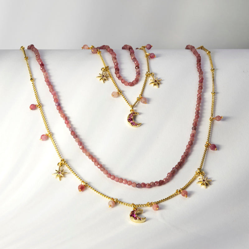
Trendy is the most dynamic, colorful, and daring line from Luxenter. Designed for women who express themselves through details, this collection turns color into its hallmark. It is a celebration of fashion as an attitude, style as a daily choice, and the power of jewelry to transform the everyday.
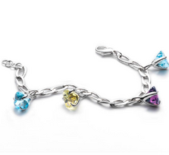
The design of Trendy mixes classic references reinterpreted with a young and current approach. Gold and rhodium finishes, luminous settings, soft volumes, and trendy details combine with stones in vivid tones such as amethysts, sapphires, rubies, and vibrant greens, as well as a strong presence of multicolor bracelets. The result is a fresh, versatile collection full of visual energy.
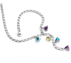
Trendy offers easy-to-wear pieces, but never predictable. From bicolor combinations to cascading bracelet compositions, each jewel is designed to add a point of light, contrast, or personality to any look. Whether in everyday life or special occasions, Trendy accompanies with style, without imposing, but always leaving a mark.
A collection designed for those who live fashion with freedom, playfulness, and confidence.
MAKE A WISH
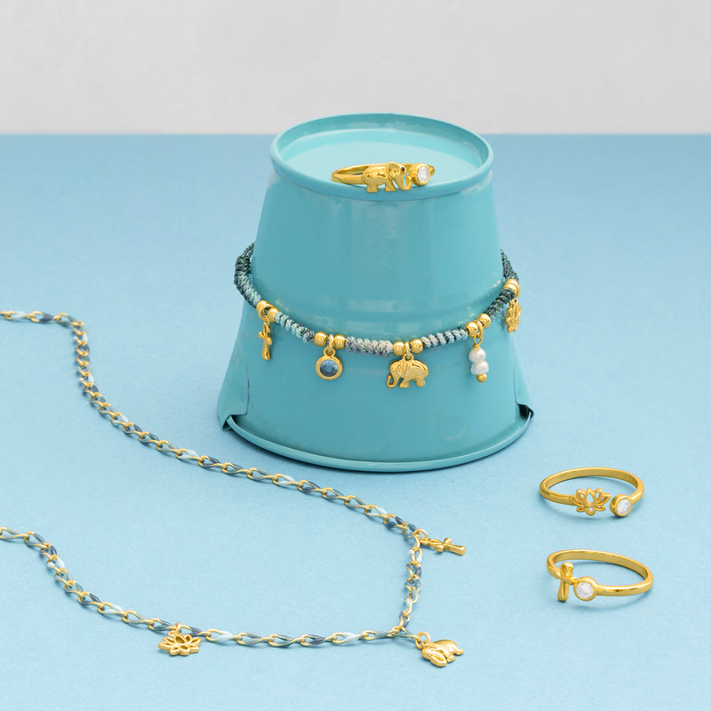
Make a Wish is a collection born from small moments, from those everyday gestures filled with intention, emotion, and meaning. Inspired by the wishes whispered in silence, this line turns symbolism into form and design into message.
The pieces are made of sterling silver with gold and rhodium finishes, and are distinguished by their soft shapes, delicate stars, sparkling chatons, and timeless motifs that connect with the personal emotion of the wearer. Pearls, color contrasts, and multicolor details are integrated into lightweight designs, created to accompany without imposing.
Make a Wish is an intimate, close, and emotional collection. Perfect for gifting — or gifting yourself — as a reminder of what is important, as a personal talisman, or as a symbol of new stages. Each jewel is a wish turned into light.
AFRICA
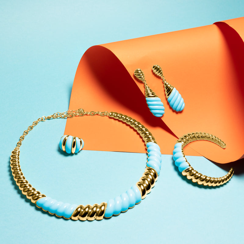
Africa is a collection that pays tribute to strength, rhythm, and connection to the earth. Inspired by the aesthetic richness of the African continent — its textures, its organic shapes, its ancestral symbolism — this line represents the most powerful and natural side of the woman.
The design is characterized by bold volumes, aged finishes, hammered effects, braided or geometric patterns that evoke artisanal techniques, and a balanced use of metal as the protagonist. The Africa jewelry is not meant to adorn, but to express: identity, character, and authenticity.
Each piece feels like a statement of timeless style, capable of coexisting with the modern without losing its root. Africa is an invitation to reconnect with the essential, to carry the symbolic as part of oneself, and to celebrate beauty without artifice.
A collection with a tribal soul and contemporary vocation.
50 designs in 50 years
SHADA
EPUL
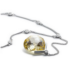
MOLO
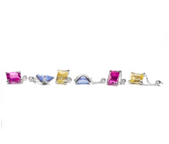
MOLO
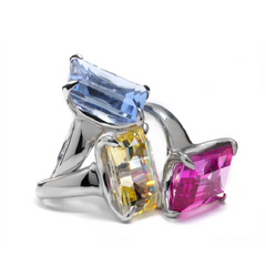
BARIDI

BARIDI
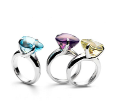
ISITYALO
ISITYALO
ISITYALO
ISITYALO
KHOTSO
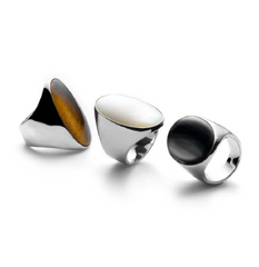
NGANGA
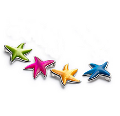
MAJIRA
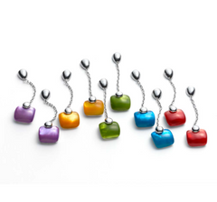
BABAIT
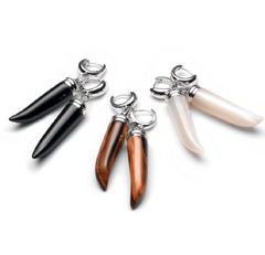
NGANGA
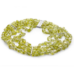
KUSASA
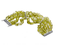
KUSASA
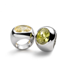
KUSASA
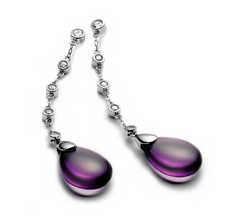
LEMVULA
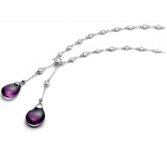
LEMVULA
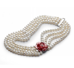
IROZA
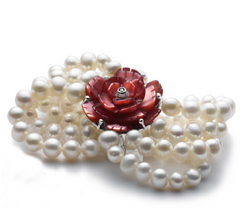
IROZA
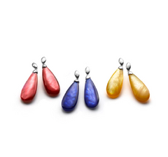
OMSHA
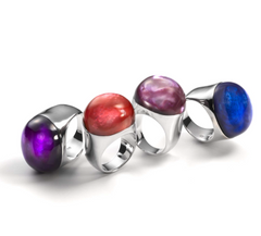
HALALA
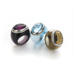
IWAKA
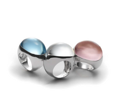
ILISO
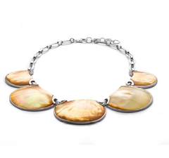
IGAMA LAMI
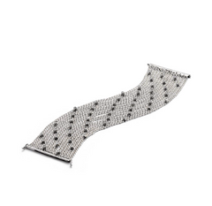
MANGOMA
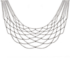
MANGOMA
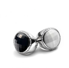
KHULU
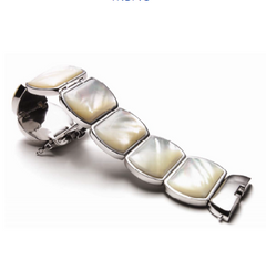
MBAO
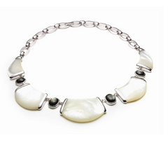
MBAO
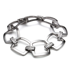
LEOPARD
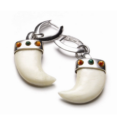
SEKA
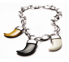
SONGA
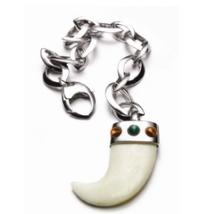
SEKA
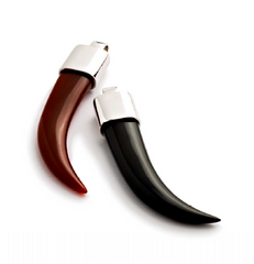
IQUDU
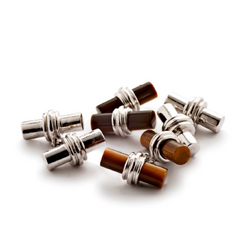
INGWE
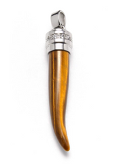
PIRI PIRI
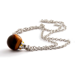
NJALO
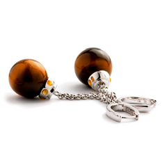
NJALO
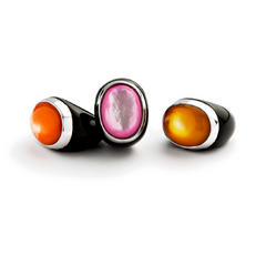
IKHULU
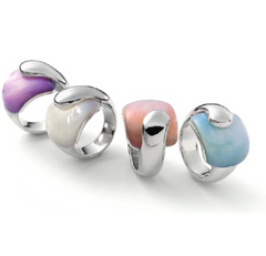
SLIME
SLIME
DUKA
MASELO MASALA
YEYE
NITO

